Branded | Hatun Haus Import Boutique
A brand of craftsmanship, ethics, and intent.
When was the last time you picked up a jar of olive oil or a scented bar of soap and wondered where it came from? It is said that the average American owns over 300,000 items in their home, but when was the last time you stopped to think about where those items have traveled from?
What We Did
Naming, Tagline,
Messaging, Logo Design,
Visual Identity System,
Copywriting,
Photography
Team
Rachel Smak, Brand Strategy, Art Direction, Photography, Copywriting
Melissa DesAutells, Logo Design
I fell into branding and marketing because, as a photographer and copywriter, I believe every product has a story. And if you listen close enough, it will tell you of the hands that held it and crafted it with care. The story of Hatun is one of a brand that stopped to ask the essential questions regarding imported goods, carefully listened to what that story was, and cared enough to change it.
It started with an idea: what if food could be traded in a way that was scrupulously honest and fair down to the last drop? Owner and founder of Hatun Fine Olive Oil asked this very question as he envisioned a trade model that would value each part of the supply chain.
It was on an adventure back to his roots while visiting the Turkish region where his grandparents lived that the idea for an imported Olive Oil business sprouted inside Onur. So he took a significant risk and plunged full force to provide a solution to an industry that still needs a ton of TLC.
In 2017 Turkish Fair Trade Imports was established, and two years later, with the success of the artisanal cold pressed-extra virgin olive oils began to expand into a global food and lifestyle brand.
With a myriad of new products being added all the time, Onur was looking to create a single cohesive branded entity to house all the imported finds he loved. Enter me.
We met for dinner and drinks to talk about his plan for the brand. Having some issues with too many brand messages and looking for a more precise way to express his brand, Onur hired me on for brand photography, a new logo, and copywriting for his website.

The vision: to create a brand that elevates each purchase to something meaningful and memorable. My task was to create a new parent brand identity, logo, and visual assets for Hatun Fine Olive Oil that spoke to the modern, boutique, online shopping experience it is while also pointing out the values of sustainability, the real impact of profit margins, and a shift towards a global mindset where people and the planet come first.
Before designing the logo and identity system, I immersed myself in the life of a Turkish olive oil farmer, wanting to deeply understand everything about them, the olive oil market, and the fair trade system. I drew inspiration from the symbols and visuals of the olive oil branch and the deep-rooted meaning behind it. The olive oil branch itself is a long-standing symbol of peace, and you often hear the expression “extending an olive branch” to another person as a desire for peace. I knew that the mark of connection and understanding at the deepest level would be an integral part of their new logo.
After thoroughly evaluating the brand and meeting extensively with Onur and his team, I came up with over 50 different names and angles before settling on the final concept. In keeping with the feel of a high-end boutique shopping experience, my team and I decided to play on words adding the word house but spelling it as revolutionary as the very business model Hatun is-Hatun Haus. Timeless, clean, and progressive were adjectives that I wanted to express through Hatun Haus’s new logo, fonts, and color scheme.
The Primary Logo:


The primary logo begins with a refined sans-serif display typeface reflecting a lighter touch and more rounded letterforms, and slightly more graceful curves than the serif typeface of the original presentation. This sans-serif typeface, dominant in hierarchy, pairs beautifully with the more minimalist sans serif text elements stacked next to the original brand name Hatun. This font pairing is modern yet timeless, and the new spelling of Haus keeps a young relevant edge in the marketplace. The hallmark of the design is the central olive oil element that is a symbol of peace, unity, and community, as well as a nod to the foundation of the Hatun brand. Rounded out by the handwritten-style script typeface and suggested body font to highlight Hatun’s authenticity and approachability in their community. Each typographic element subtly supports the larger brand while giving their identities some definition and lending a touch of personality and slightly playful movement to the composition.
While the old logo was confusing and didn’t correlate with the Turkish culture or olive oil in any way and felt a bit too cerebral, the new logo communicates personability, relevant yet refined energy, and a fresh modern sensibility at every touchpoint.
For colors, we choose a dark mocha as the primary color, which represents simplicity, comfort, and dependability. It’s a color often seen in nature, so it gives off that organic, all-natural vibe that is a brand trademark. The warm, cozy shade of brown made perfect sense as a rooted color and was paired with olive green or “Zeytin Rengi,” as is the Turkish translation. Olive green is also the traditional color of peace. Oyster was added as a supporting color and is gaining traction in everything from weddings to interior design. This warm grey rounded out the logo in neutrality and balance.
Website Taglines:
At Hatun Haus, we pour our hearts into everything we make for the ones who are doing precisely the same thing.

It’s not just about Turkish olives; it’s about relationships. Olive them.

Scrupulously honest to the last drop

For the website copy, I worked to create fun and catchy phrases mixed with elements of Onur’s story and Hatun’s mission.

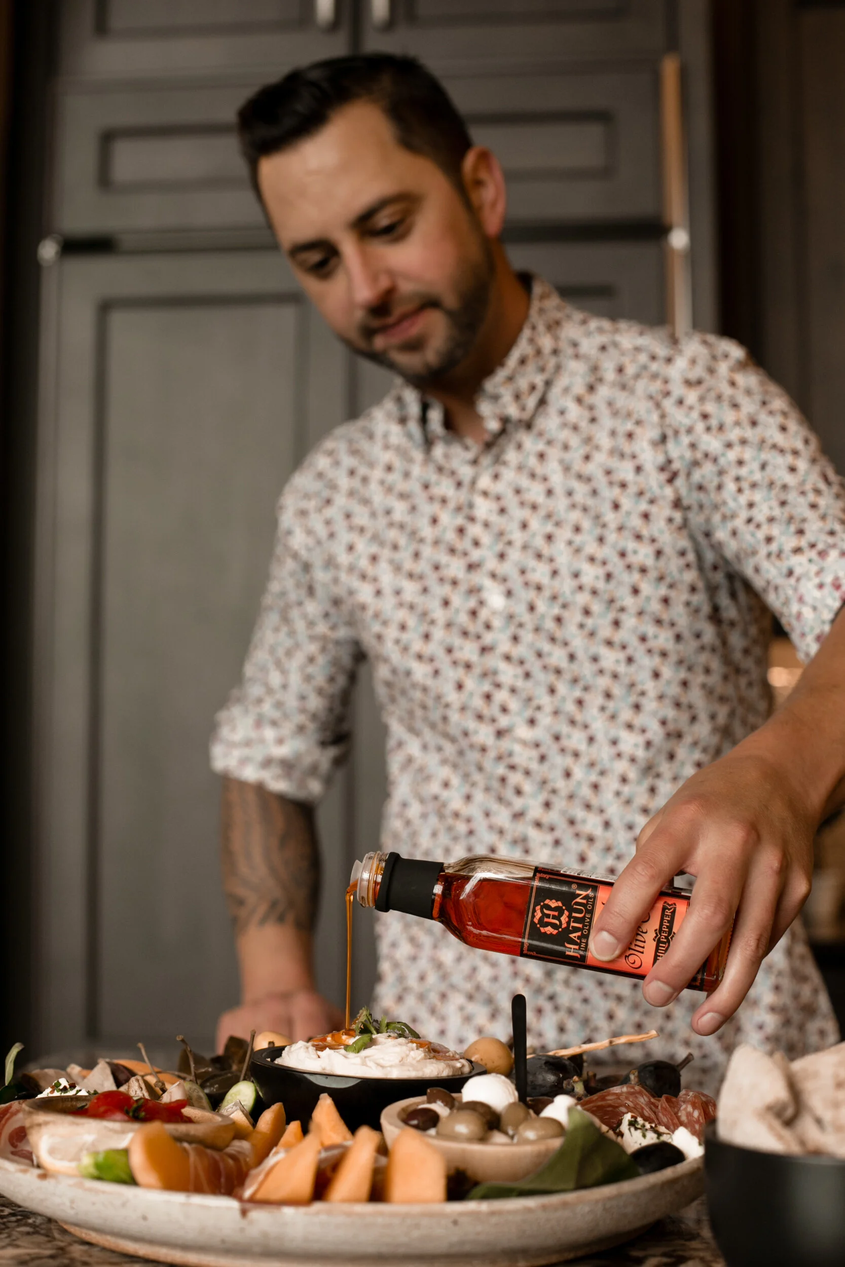
The final deliverable was putting together visual imagery that paired with the new brand direction. I photographed three different product lines, the high-quality olive oil, the organic scented bar soaps, and the hand-painted Turkish ceramics, all of which support trade that is truly equitable for all.
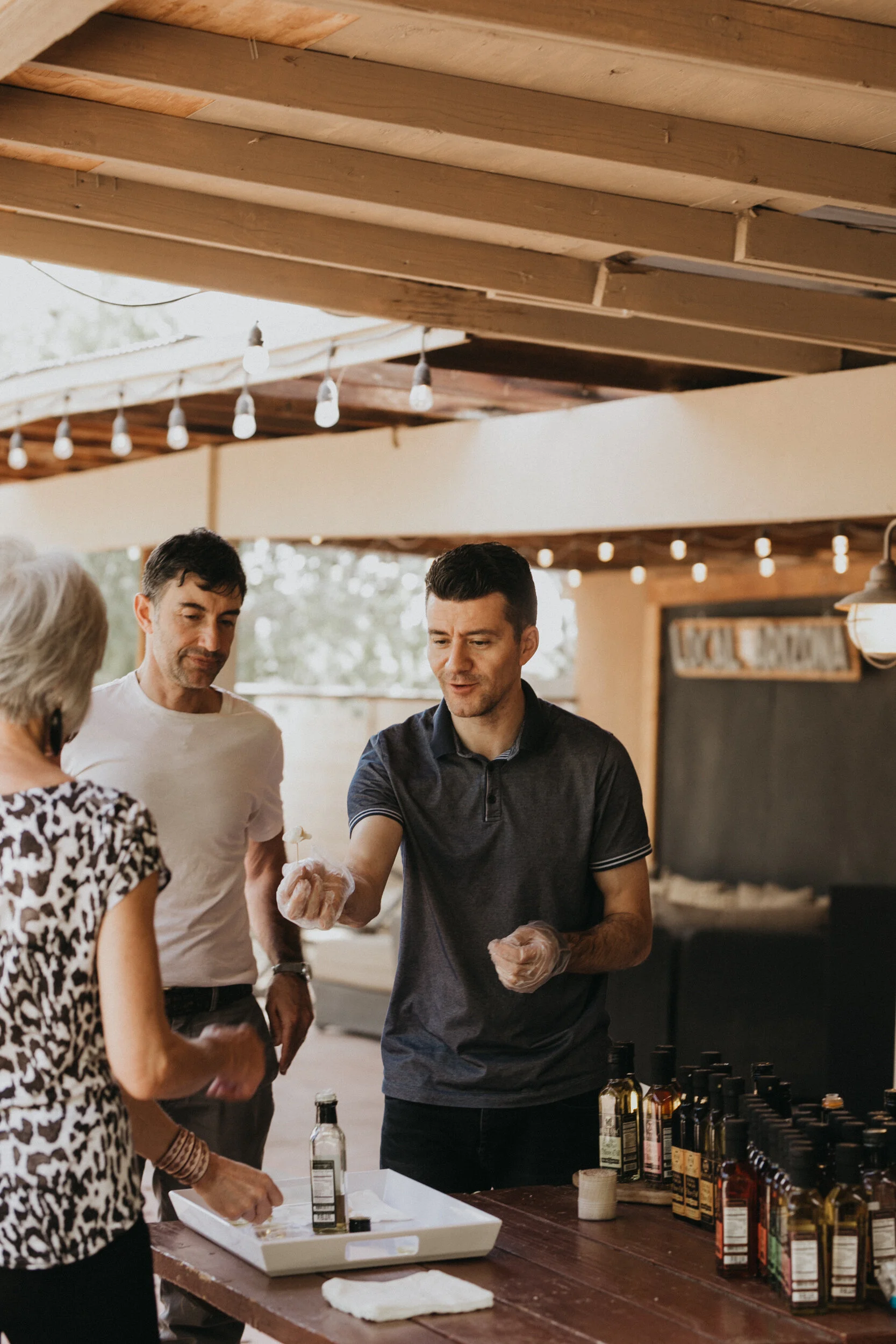
We visited the Phoenix Public Market and later, Studio M Interiors when I was working in Minneapolis. My good friend Melissa DesAutells with Designs of Any Kind not only lent her talent with the Hatun Haus logo, but she also helped stylize some of the sets we shot and even stepped in to model!